The last number of weeks have been a bit quiet around these parts and for that I apologize. Our house has been under a mission. A mission to regain our sanity and our composure in this thing called remodeling. I declared all out war on the clutter and am delighted to say that it has made a huge difference in the level of composure and cleanliness in our home.
We are still in process though and I am currently down with the flu so I can’t muster up the energy to get all the photos up on here today. Tomorrow I am hopeful will greet me with more of a human feeling and less of a “I’ve been run over by a Mac truck” sensation.
But since I have been basically bed ridden for a few days I have gotten to log some much needed redesign time on the blog.
I am completely self taught on this whole website building and photoshop thing which means that something that could take a pro an hour takes me six….or eight.
But I’ve really been wanting to rework the header on the blog and spruce up around here so I got to it.
This is what it used to look like remember?
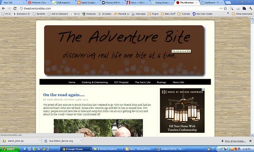
Not terrible but nothing fabulous either. I love the grasscloth background so that definitely gets to stay.
I got to work on the header image because I knew it would give me the most bang for my buck and it’s the thing I struggle the most with. I really need multiple hours of dedicated time to do design stuff like this because I am still so new at it all. Lying in bed aching up a storm and going through sudden fever flashes seemed like a good time to do it.
Needless to say I went through a ton of design changes. Lots of inspiration pictures. Hundreds of fonts to find any that even remotely achieved what I wanted. I started off knowing that I wanted a chalkboard feel to the header image but not much else defined.
Here were some of my inspiration pieces:
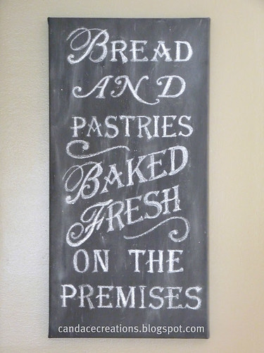
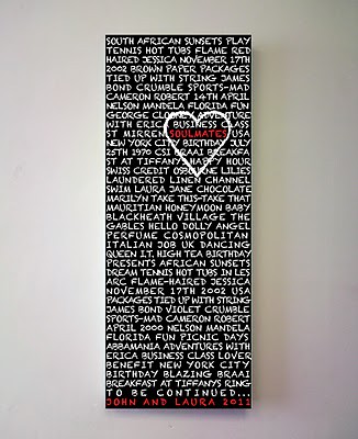
I loved everything about this chalkboard art. So much so that I really may have to make one myself (can you believe this one is actually canvas?!) As always photos link to the creators site and she has a great tutorial if you luve it too.
The cursive first letters and solid block letters for the text really worked well for the design I ended up with.
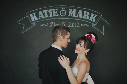
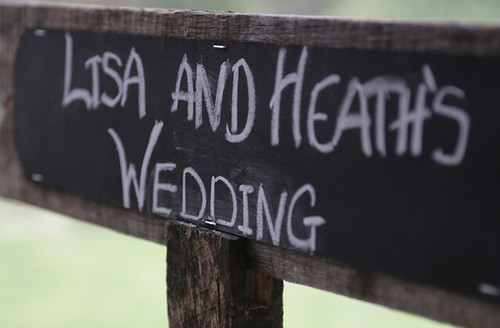
I love this couples whole chalkboard wedding…so classy and vintage. I was in love with the banner art and went on a wild unsuccessful rampage trying to incorporate one.
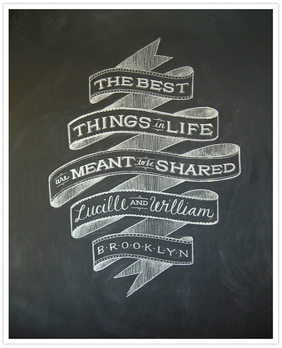
Like this one…The lady that makes these is ridiculously talented, be sure to check out her other designs through the link. The textures in her work is incredible. Unfortunately I couldn’t seem to find any solutions that worked out right and didn’t really want an entire banner header so after a few tries I went back to the drawing board. If I had a few thousand dollars I’m sure I could commission her…..so I’ll be sure to put that on my list for the next time I have a few extra lying around.
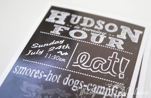
Then I found this:
Ta da! That was it! Classy and simple. A chalkboard sign on old barnwood was the perfect mixture I had been looking for. I had tried chalkboard frames, no frame, borders. Nothing looked quite right and gave it the comfy, lived in, come on in and have a cup of Chai with me kind of feel I was going for. Once I hit this idea I was in my groove. A classy gray chalkboard background pulled in the slightly textured feeling and the old wood was hijacked from a photo of a wooden picture frame.
I worked through a dozen fonts trying to find the right fit and finally came up with having to use two different fonts in combination with changing sizing for the first letters to achieve the effect I was looking for. It was good, but it still didn’t have quite the wow factor it needed too.

Back to inspiration photos. Scroll, scroll, scroll. Drink more Gatorade, take more painkillers.
Bam. There it is.
Customized versions of “a few of my favorite things” signs? Yes, I think I shall have one thank you very much. One of these may be showing up on a wall in my house here in the not so distant future.
I had been trying out a variety of words placed in different areas of the header but it didn’t really make sense, yet I couldn’t shake the idea that it needed to happen. Suddenly it clicked and I quickly scrolled back through some of my older photos to this one:
I had loved the dotted separation lines and quickly learned that she had made them by simply using a long line of periods in a block font. Smart. She also has a super cute little boys camping birthday party theme going that I have definitely filed away for a future party.
So I whipped up a long line and flipped it vertically, in a few minutes time I had made my own version of my favorite things and completed the header at the same time! I am feeling quite proud if I do say so myself.

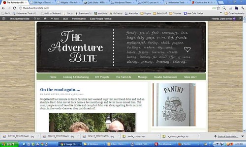
I love how the smudges in the background come through and how everything feels a little fancy but a little old too. And the colors, I’m on a total gray streak right now. I think it must have been all the gray and black we saw while we were in Charleston. I have made a few of the other changes including swapping some colors around and enlarging the menu items.
I’m loving the change, how about you?
But it just wasn’t finished yet. After staring at it another day and doing some other minor major changes on behind the scenes stuff it still just wasn’t cutting it for me.
It was classy but muted. It needed some love. It needed some pop. It needed blue.
Have I mentioned the color kicks I’m on lately?
Blue and gray seem to be everywhere I touch. So without further ado I gave it some pop!
Oo ee oo ah ah ting tang walla walla bing bang oo ee oo ah ah ting tang walla walla bing bong!
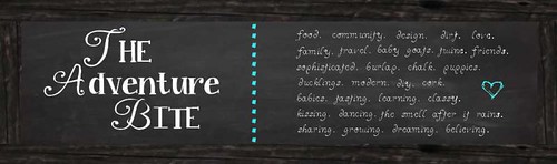
Yeah sorry. Now you’ll have that stuck in your head all day long. There could be worse things. Like the muppets. Or Christmas songs. Don’t get me started.
Ummm. Anyways I kind of love it. Oh and I changed the words on the top lines. So they made more sense.
And I changed the header titles. And. And. And. I’m sure you can see lots more without me explaining. But…..
I gotta go cook dinner.
Poke around. Love it. Jump up and down because its beautiful and screams to be stared at for days.
Ta!


I LOVE the new header!!! It is so YOU 🙂 Uniquely Vintage 🙂 always amazes me how much time and patience with details all of this site workork requires. Great job!